Metrics Overview
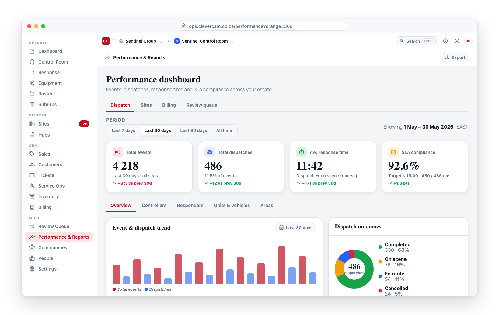
The Performance dashboard gives you a clear, data-driven view of how your security operation is performing. It brings together event data, dispatch records, response times, and SLA compliance into a single dashboard with multiple views. Use these metrics to identify trends, measure your team's effectiveness, allocate resources, and demonstrate your value to clients.
Accessing the Performance Dashboard
-
Navigate to Performance & Reports in the sidebar. The page itself is available to every control room — it gates per tab instead.
-
The page has up to five top-level tabs:
Tab Shown when Dispatch Advanced Alarm Handling is on — every figure here is drawn from dispatch records, which a control room that dispatches from other software never creates Sites always Billing the CRM module is on Reports always (the report list itself varies — see Export & Reports) Reviews the CRM module is on -
With Advanced Alarm Handling on, the page opens on Dispatch with a summary of key metrics drawn from your dispatch data. Without it, the page opens on Sites.
Inside the Sites tab, two of the four sub-tabs are conditional as well: False alarms needs Advanced Alarm Handling (it is measured against dispatch outcomes), and Bypasses needs the 3rd Party Alarm Receivers module, since zone bypasses arrive as alarm-panel signals. For the same reason the Overview table drops its Dispatches / False alarm rate columns without Advanced Alarm Handling, and its two Bypasses columns without Alarm Receivers, rather than showing columns that can only ever read zero.
This page covers the Dispatch, Sites, and Billing tabs in detail below. Reports and Reviews have their own pages: Export & Reports and Customer Reviews. The management Review Queue — together with Costliest clients and Pattern detection — has been promoted out of this page into its own top-level command center; see Review Queue.
Key Metrics
The top of the dashboard displays four headline numbers:
Total Events
The total number of security events detected across all your sites during the selected period (see Choosing the Overview period below). This includes all event types — intrusions, motion alerts, tamper events, and more.
Total Dispatches
The number of times a response unit was dispatched to handle an event. Not every event results in a dispatch (some may be false alarms dismissed by operators), so this number is typically lower than total events.
Average Response Time
The average time from when an event is dispatched to when a response unit arrives on scene. This is one of the most important operational metrics — faster response times generally lead to better outcomes and higher client satisfaction.
SLA Compliance Percentage
The percentage of dispatched events where the response time met your defined SLA target. For example, if your SLA requires a response within 15 minutes and 90 out of 100 dispatches met that target, your compliance is 90%.
SLA targets are configured in Review Queue → Response SLAs. The compliance percentage shown here reflects those configured rules.
Choosing the Overview period
A Period picker sits directly above the four headline numbers on the Overview sub-tab, with options Last 7 days (the default), Last 30 days, Last 90 days, and All time. The selection scopes the four KPI cards (Total Events, Total Dispatches, Average Response Time, SLA Compliance), the Dispatch Outcomes breakdown, the Events by Hour of Day / Events by Day of Week charts, and the Responders, Units & Vehicles, and Areas tables to that window, and the chosen window is named on every card so a figure is never ambiguous. The selection is reflected in the URL (?period=7d / ?period=30d / ?period=90d / ?period=all) and is also remembered per browser, so your last-used window is applied automatically on the next visit (a URL parameter wins over the remembered value).
Unlike the KPI cards (which filter data already loaded for the page), the two charts fetch fresh from the server each time you change the Period picker, so there's a brief "Loading..." moment on switch. This keeps the payload small regardless of how far back "All time" reaches.
Dispatch Tab Sections
Below the headline figures, the Dispatch tab splits into a row of sub-tabs:
- Overview -- Period trend bar chart, outcome breakdown (completed / cancelled / on scene / en route), SLA breaches table, and the hourly heatmap (day-of-week × hour-of-day) showing when events and dispatches occur most often.
- Controllers -- Per control-room operator activity. See Controllers sub-tab below.
- Responders -- A breakdown by individual responder showing dispatches participated in, average response time, and areas covered. Follows the selected Period.
- Units & Vehicles -- Per-unit table (dispatches handled, average response time, time on scene, total busy time), which follows the selected Period, and a per-vehicle Vehicle Utilization table (dispatches, average response time, total busy time, last telemetry) — the utilization table shows lifetime totals per vehicle and says so on the table, unaffected by the period filter.
- Areas -- A breakdown by area showing total dispatches, average response time, and SLA compliance. Follows the selected Period.
- Dispatch Copilot -- Proof that the unit recommender is working: median time-to-dispatch (pre-Copilot baseline vs Copilot era) and top-rank hit-rate, with a per-dispatch decision audit. See Dispatch Copilot. AAH control rooms only.
Controllers sub-tab
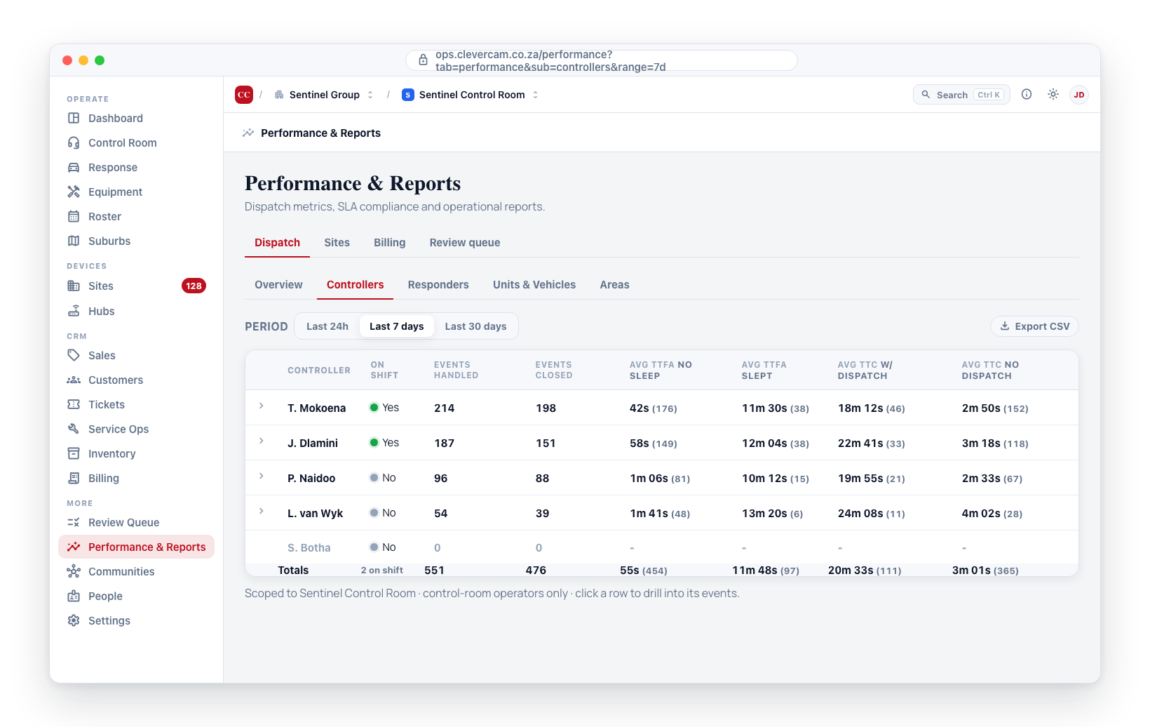
The Controllers sub-tab answers "how is each control-room operator performing right now?" without leaving the Performance page. It is scoped to the VCR you are currently viewing, and only includes team members with team_member_type = 'control room' (responders and vehicles live on the other sub-tabs).
Choosing a period
A row of period buttons at the top of the sub-tab switches the window the metrics are calculated over:
- Last 24h (default)
- Last 7 days
- Last 30 days
The selection is reflected in the URL (?range=24h / ?range=7d / ?range=30d) so a bookmarked view of "last 7 days for VCR Pretoria HQ" survives a refresh.
Columns
| Column | What it means |
|---|---|
| Controller | The operator's display name from the Control Room roster. |
| On shift | Green dot when the operator is currently clocked in (vcr_team_members.is_on_shift = true), grey otherwise. |
| Events handled | Distinct events the controller took any action on during the period. Includes notes, calls, dispatches, closes -- any row that operator has against the event in the underlying action log. |
| Events closed | Subset of Events handled where the controller themselves marked the event complete (they're the most recent operator on the closure action). |
| Avg TTFA (no sleep) | Mean of (first action on event) − (event's original creation time) across events that were never put to sleep on this VCR's kanban. This is the clean operator-responsiveness metric. The bracketed number is the sample size. |
| Avg TTFA (slept) | Same delta, but for events that were put to sleep (e.g. a pair_grace 10-minute hold). The deliberate sleep window inflates this by design, so a high value here is not an operator failure -- it's a configured wait. Compare against no sleep to see how much sleep is shifting the headline number. |
| Avg time to complete (w/ dispatch) | Mean of (closure time) − (event's original creation time) for closed events that triggered a dispatch (a vcr_dispatches row with dispatched_at set for the event, by any team member on this VCR). The bracketed number next to the value is how many events fed the average. |
| Avg time to complete (no dispatch) | Mean of the same delta for closed events resolved without a dispatch -- typically false alarms cleared by the controller after verification. The bracketed number is the supporting sample size. |
A controller who closes 100 false alarms in 3 minutes each and a controller who runs 5 real responses with 25-minute resolutions are doing very different work. Pooling them under a single "average" hides both. Splitting by dispatch makes the two workloads legible: the no-dispatch number is your triage speed, the with-dispatch number is your end-to-end response speed.
Some events are deliberately put to sleep when they arrive at the control room -- a pair_grace 10-minute hold while the system waits to see if a follow-up alarm arrives, for example. The operator doesn't see the event during the sleep window, so any TTFA measured from event-creation includes that hold. Splitting no sleep from slept keeps the "how responsive is this operator?" number honest, while still exposing the slept-event volume so you can see how often the sleep policy is firing on this VCR.
On VCRs that don't use the per-event kanban (some snapshot-wall workflows), every event lands in no sleep by design -- there is no sleep mechanic in that flow.
Anchoring TTFA on the original event creation (the moment the alarm fired at the site) rather than the moment it arrived at the control room makes the metric apples-to-apples across hubs with very different network conditions. A slow uplink that delays delivery to the VCR will show up in this number -- which is what you want for an end-to-end view of customer experience.
A cell shows - when the metric has no input -- for example, a controller with zero Events closed shows - under Avg time to complete. Operators with zero activity in the window still appear in the table with 0 counts so you can see who is rostered but not handling events.
Totals row + CSV export
A bold Totals row at the foot of the table sums every column across the controllers currently in view. Events handled and Events closed are simple sums; the four averages (TTFA no-sleep / TTFA slept / TTC dispatched / TTC no-dispatch) are weighted by the supporting event count -- a controller who handled 500 events contributes 500x more weight to the team's average than one who handled 1. The bracketed (n) is the team-wide sample size for that bucket.
The On shift column on the totals row shows how many controllers are currently clocked in (not a true / false -- a count, e.g. 3 on shift).
An Export CSV button appears next to the period selector (top-right) once the table has at least one event in scope. The download includes every controller row with all twelve metric columns plus a header row, named controllers-<range>-<YYYY-MM-DD>.csv so it sorts cleanly in a folder of exports. Useful for monthly reporting, payroll inputs, or feeding into your own BI tool.
Drilling into a controller
Click any row in the Controllers table to expand it inline. The drawer below the row lists every event in the window that fed into that controller's aggregates, newest event first:
| Column | What it shows |
|---|---|
| Event | Event ID + a short description. Click the ID to jump straight to the event details page. |
| Site | The site the event came from. |
| CID | The Contact ID code (e.g. E130 burglary, E350 offline). |
| Created | When the alarm originally fired. |
| TTFA | Time to this controller's first action on the event. |
| TTR | Time to close, if this controller closed it. Open events show open. |
| Dispatched | YES if a dispatch landed for the event (any team member, this VCR), no otherwise. |
| Slept | YES if the event was ever put to sleep on this VCR's kanban (vcr_events.sleep_started_at set), no otherwise. Use to spot whether a slow TTFA is real or just a sleep window. |
Rows with zero Events handled are not clickable -- there's nothing to drill into. Open rows are cached, so collapsing and re-expanding the same controller in the same window doesn't re-hit the database.
How to read the numbers
| Pattern | What it usually means |
|---|---|
| High Events handled, low TTFA, low TTR | Star performer working a high-volume shift cleanly. |
| High Events handled, low Events closed | Operator is triaging and handing off (e.g. to a supervisor or the AI Brain) rather than closing themselves. Cross-reference with the Review Queue to see if closes are landing elsewhere. |
| Low Events handled, high TTFA | Either the operator was idle and slow to pick up, or they are working long-running events with sparse follow-up actions. |
| TTFA significantly higher than TTR | Events sit in the queue a long time before first touch, then get resolved quickly once seen -- a backlog signal, not a competence signal. |
Sites Tab
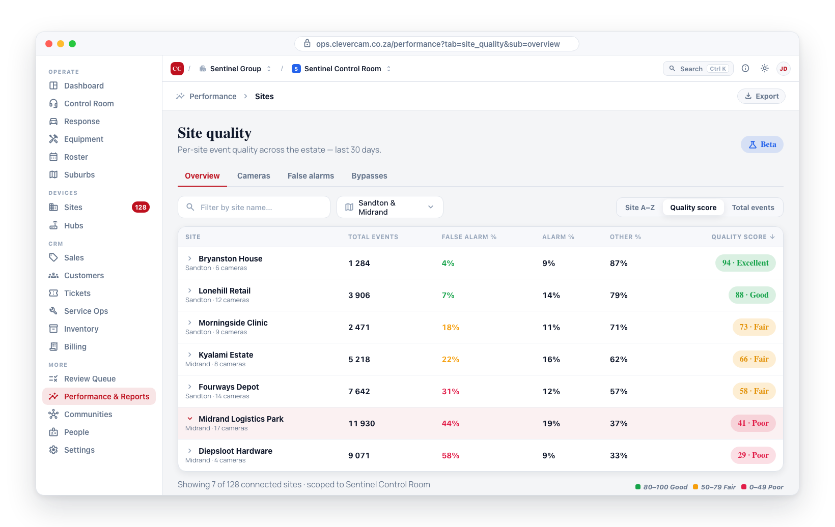
The Sites tab groups every site-quality lens: cross-cutting Overview, per-Camera quality, False Alarms ranking, and the per-zone Bypasses list. Each sub-tab has its own filter and export controls.
Billing Tab
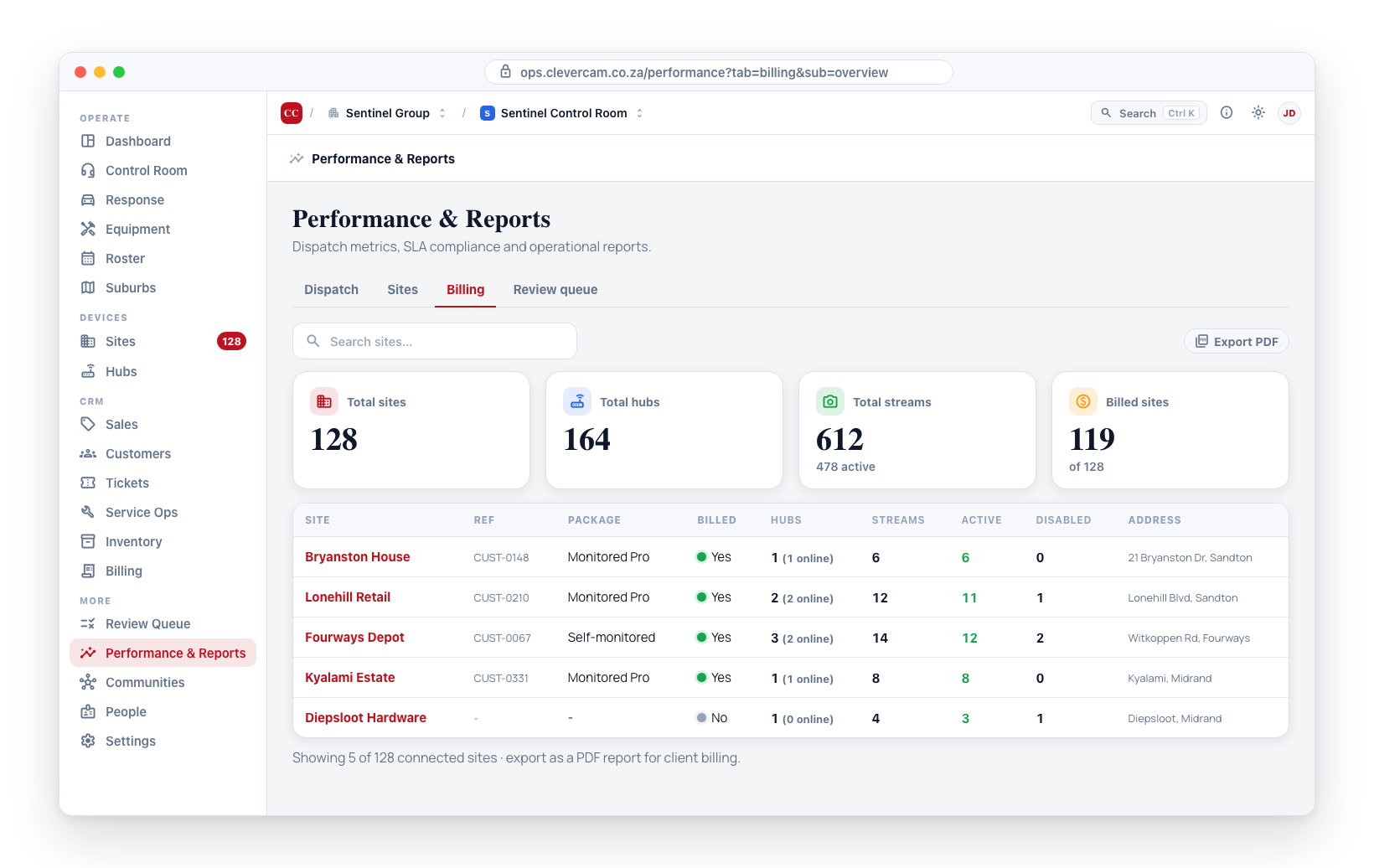
The Billing tab shows a summary of site billing statuses including the monitoring package and billing flags. You can export this data as a PDF report.
Management Review Queue
The management Review Queue — the Brain's inbox of cost, fault, contactability, open/close and recurring-pattern items that need a manager's eyes — is now its own top-level command center, no longer a tab on this page. It has a summary hero, severity / category / status filters and search, one-click resolve / snooze / tighten / SOP-variant actions, and a live nav badge showing how many items are open.
See Review Queue for the full walkthrough.
Reading the Dashboard
Here is how to interpret the metrics in context:
| Metric | Good Sign | Warning Sign |
|---|---|---|
| Total Events | Stable or decreasing over time | A sudden spike may indicate a new threat or a sensor issue |
| Total Dispatches | Proportional to events | A very low ratio may indicate missed events; a very high ratio may indicate over-dispatching |
| Avg Response Time | Within your SLA targets | Consistently close to or over your targets |
| SLA Compliance | Above 90% | Below 80% indicates systemic response delays |
Review performance metrics at least weekly. Establish a routine where operations managers check the dashboard every Monday to assess the previous week's performance and plan any improvements.
Using Metrics for Decisions
Performance data supports several key decisions:
- Staffing -- If response times are climbing, you may need more units or responders on duty.
- Area restructuring -- If one area consistently has far more events than others, consider splitting it into two smaller areas.
- Training -- If certain units have slower response times, targeted training may help.
- Client reporting -- Use these metrics in client reports to demonstrate the level of service you are providing.