Heatmaps
The heatmap view gives you a visual picture of when security events are most concentrated — broken down by hour of the day and day of the week. It helps you understand your operation's activity patterns, identify your busiest periods, and make better decisions about staffing, shift scheduling, and resource allocation.
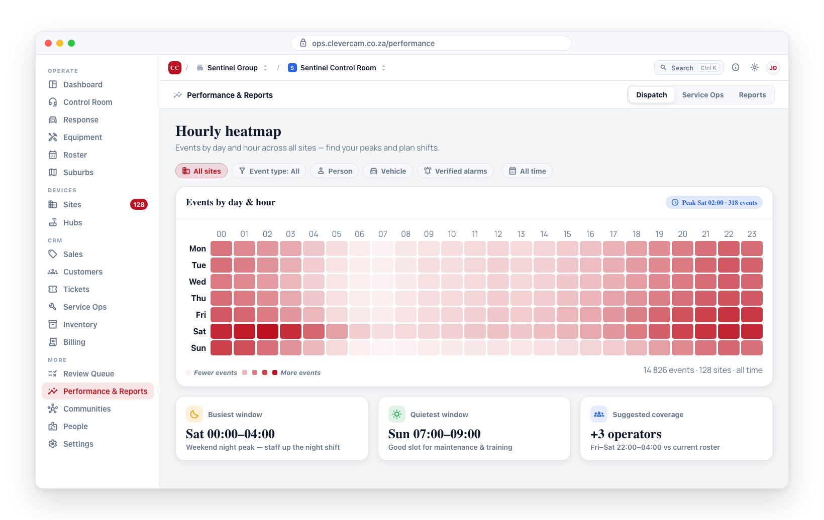
Understanding the Heatmap
The heatmap is displayed as a grid:
- Horizontal axis (columns) -- Hours of the day, from 00:00 to 23:00. Every clock in CleverOps is 24-hour.
- Vertical axis (rows) -- Days of the week, from Monday to Sunday.
- Cell colour intensity -- Each cell's colour represents the number of events during that hour on that day. Darker or more intense colours indicate higher activity; lighter colours indicate fewer events.
Accessing the Heatmap
- Navigate to Performance & Reports in the sidebar.
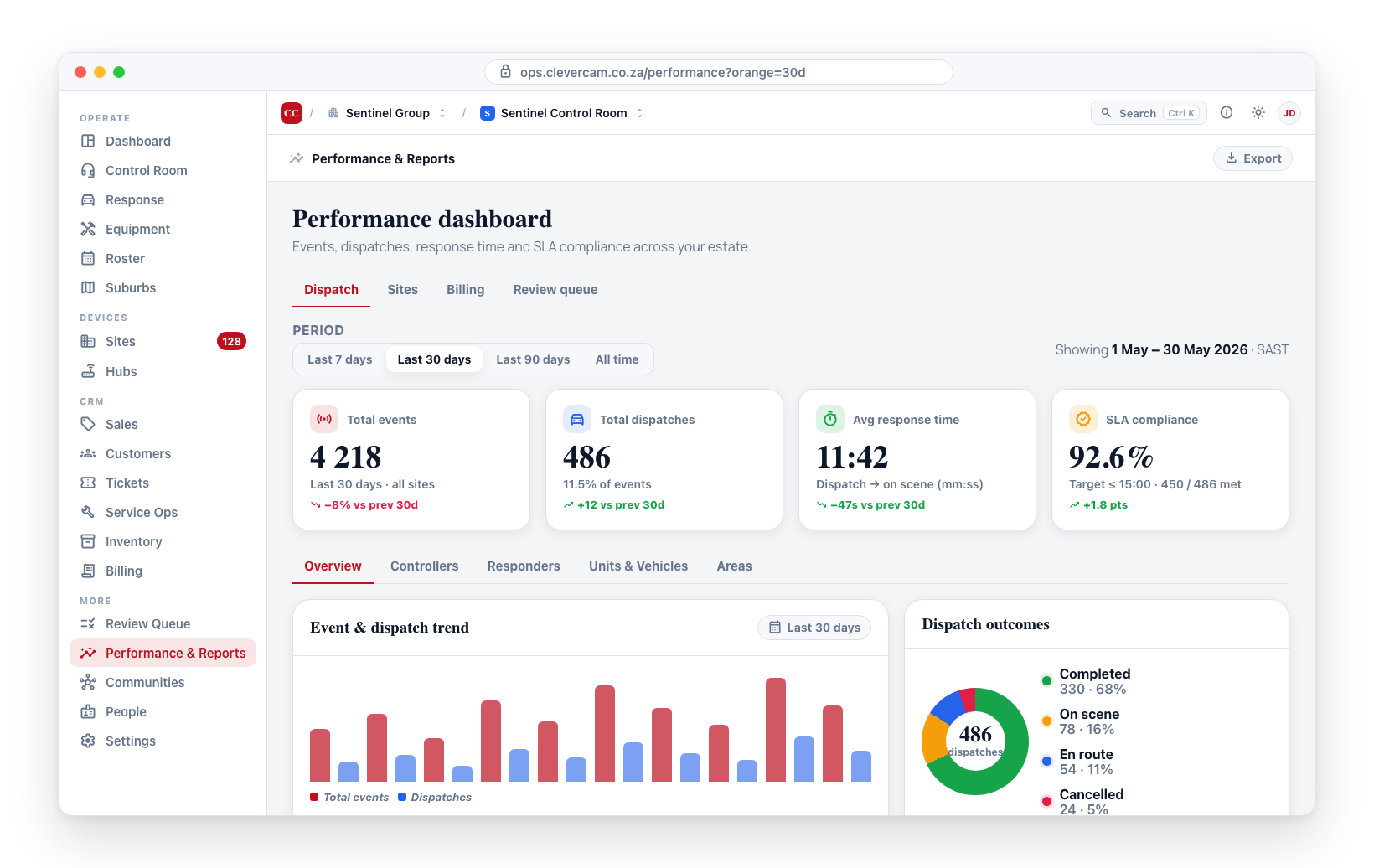
- On the Dispatch tab, scroll down to the Hourly heatmap section.
- The heatmap loads with event data for your company.
Reading the Heatmap
Here is how to interpret what you see:
- Hot spots (dark cells) -- Times of high event activity. These are the periods when your control room and response teams are busiest.
- Cool spots (light cells) -- Times of low event activity. These are quieter periods.
- Patterns -- Look for recurring patterns. For example, events may spike during late-night hours on weekdays (typical for commercial break-ins) or on specific days (events may be lower on weekends if most of your sites are commercial).
Example Interpretation
| Pattern | What It Means |
|---|---|
| High density 22:00-04:00 weekdays | Nighttime activity peaks — ensure adequate night shift coverage |
| High density Friday/Saturday nights | Weekend activity — consider extra units on these nights |
| Low density Sunday mornings | Quiet period — a good opportunity to schedule maintenance or training |
| Uniform density across all hours | Events are evenly distributed — maintain consistent staffing |
Using Heatmaps for Staffing
The heatmap is one of the most powerful tools for shift planning:
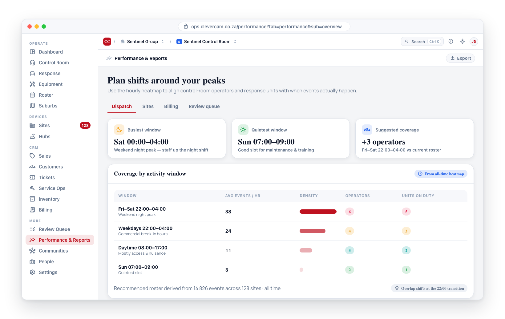
- Identify peak hours -- Look at the darkest cells to determine when the most events occur.
- Schedule more operators during peaks -- Ensure your control room has the most operators available during high-activity periods.
- Deploy more response units during peaks -- Have additional units on duty during the hours and days with the most events.
- Reduce staffing during quiet periods -- If certain time slots consistently show low activity, you may be able to reduce staffing without affecting your service quality.
Instead of using generic 8-hour shifts, use the heatmap to design shifts that align with actual event patterns. Overlap shifts during transition periods where activity changes significantly.
Heatmap Data
The heatmap shows combined data across all of your sites. Each cell displays the number of events and dispatches for that hour and day combination. The colour intensity reflects the volume of activity.
Event patterns often shift with the seasons. Shorter daylight hours in winter may push event peaks earlier in the evening. Holiday periods may change the day-of-week pattern. Review the heatmap periodically to spot these trends.