Map Layers
The Units Map supports four independent overlays that can be toggled on and off from the Layers panel in the top-left corner of the map. Each operator's preferences are saved per browser, so the layers you have visible persist across sessions.
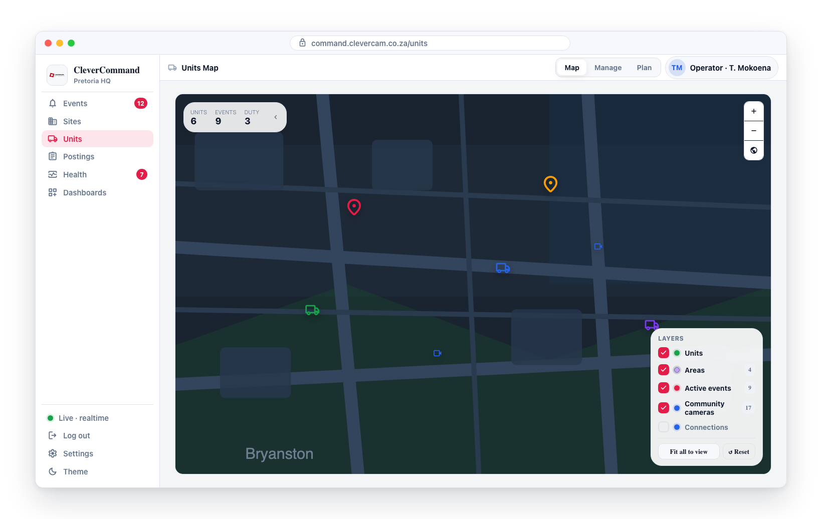
Opening the Layers panel
- Open the Units Map (sidebar → Units)
- Locate the Layers panel in the bottom-right corner of the map
- Tick or untick a checkbox to show or hide that overlay
The panel also shows live counts next to Areas, Active events, and Community cameras so you know at a glance how many features are on the map.
Units layer
The Units layer shows live response-unit and responder markers — the existing GPS-tracking behaviour described in GPS Tracking.
Hiding the Units layer hides every unit and standalone responder marker on the map without affecting the sidebar list.
Areas layer
The Areas layer renders the response areas configured for the current Virtual Control Room as soft coloured polygons.
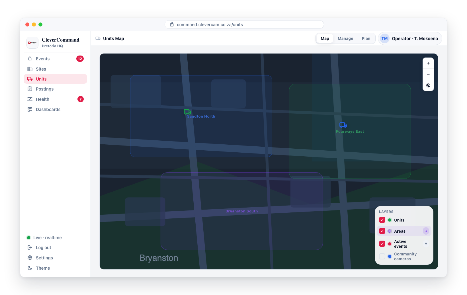
- Each area is filled at very low opacity using its configured colour, with a thin half-opacity outline of the same colour and a muted centred label — deliberately styled to fade into the background so it doesn't compete with units, events, or cameras
- Only areas with
is_enabled = trueare drawn - The polygon geometry comes from the
boundaryGeoJSON column on each area record
This is useful for confirming that a dispatched unit is operating inside its assigned territory, or for spotting events that fall outside any defined area.
Areas are managed elsewhere — the Units Map only renders them. To create or edit an area boundary, use the area editor in Event Details.
Active events layer
The Active events layer shows every event in your operator queue — the same set you see on the Events page — as a coloured dot at the event's geographic location. The layer is scoped by your responder_id, so two operators in the same VCR may see slightly different sets if their queues differ. Events disappear from the layer the moment they are closed.
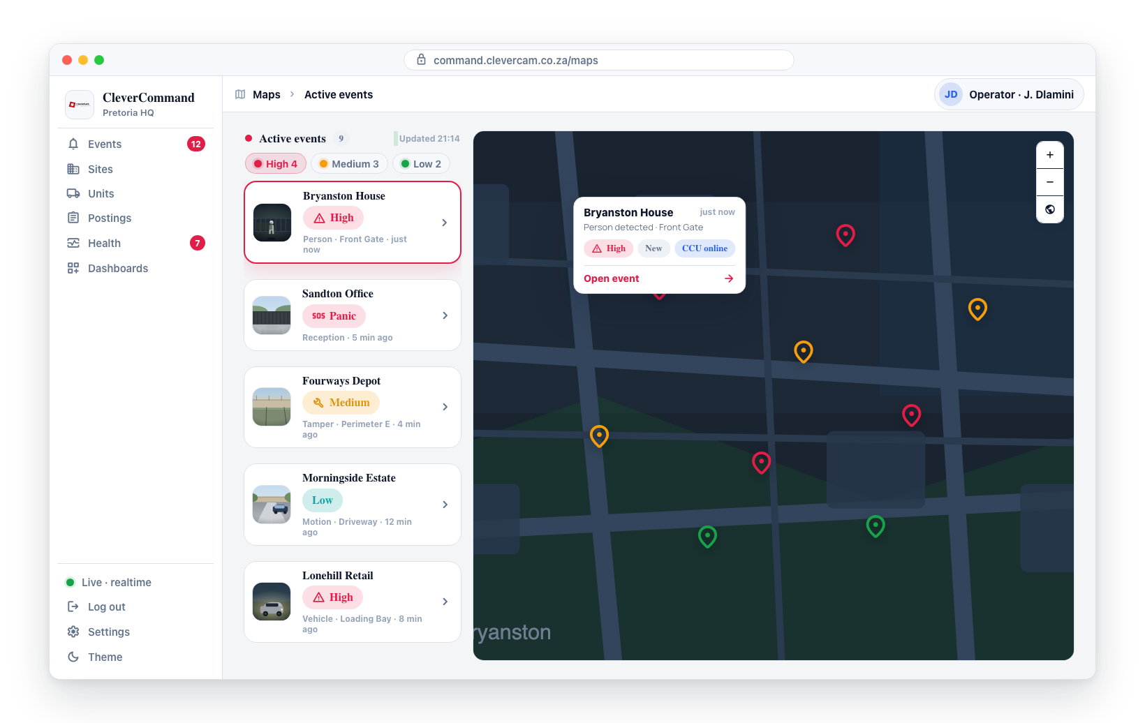
Coordinates are resolved per event in this order:
- The event's own
event_latitude/event_longitude(set when the detection includes GPS, e.g. duress events from a phone) - The linked site's
address_latitude/address_longitude(the fallback for the vast majority of CCU events that have no per-event coords) - Skipped silently if neither is available
This means almost every event you see on the Events page should also show on the map at its site location.
Alert-pin marker
Each event renders as a two-layer "alert pin" so it reads at a glance even under cluttered basemaps:
- Outer halo — large translucent ring in the state colour. Higher opacity for high-attention states (queued, dispatched) so they pulse visually.
- Triangle glyph — a downward-pointing triangle (▼) in the state colour with a white outline, centred on the location.
Click anywhere on the halo (the largest hit area) to open the popup — the click handler is bound to the halo layer so the whole marker is interactive.
Duress markers
Duress events get a pre-attentive treatment on top of the standard marker, so they read before any other dot on the map:
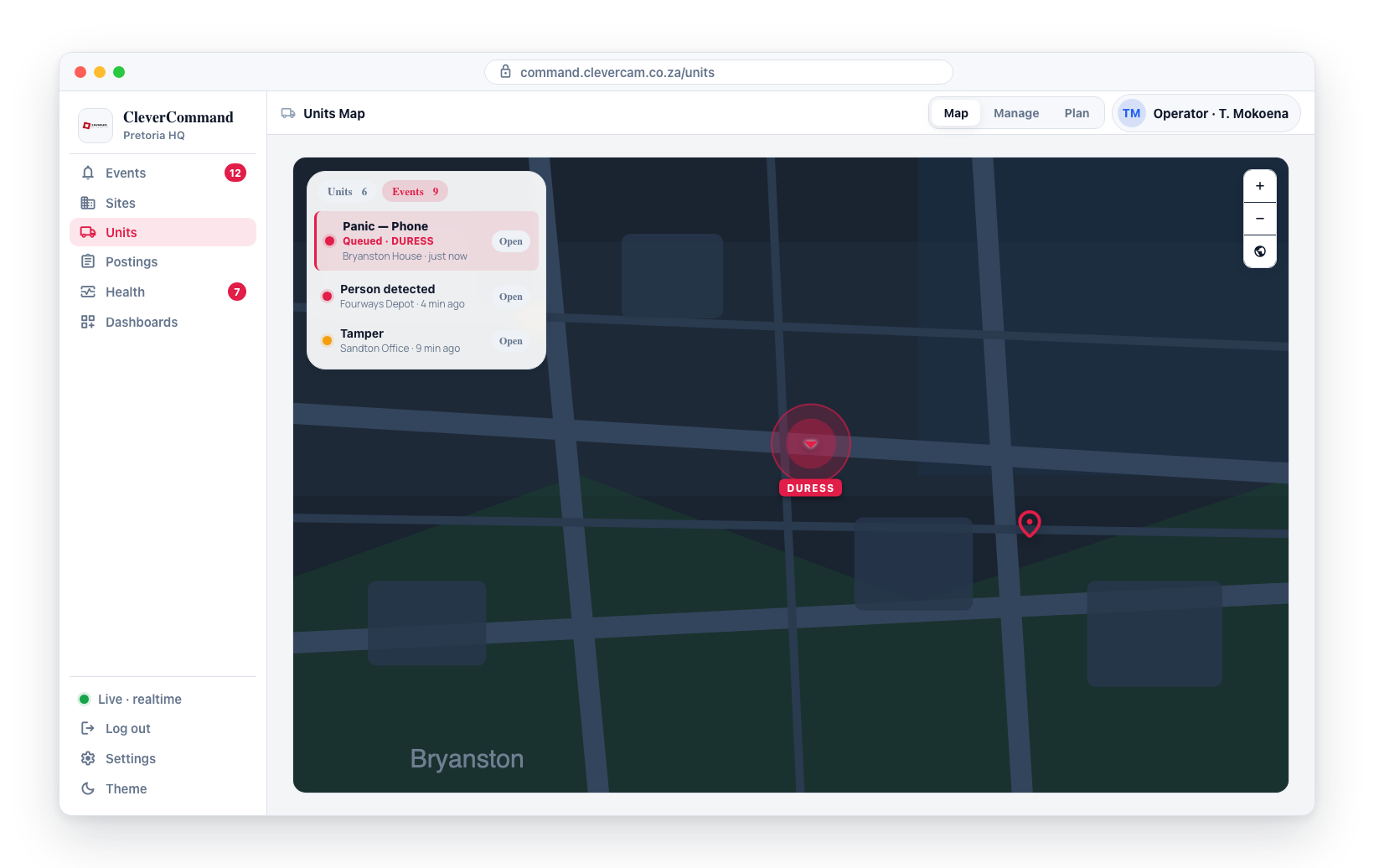
- A continuously pulsing red ring that expands and fades on a fast (1.2s) cycle for as long as the duress event is open — unlike the 30-second dispatch pulse, it never stops on its own.
- An always-visible red DURESS text label under the marker (no click needed).
- In the Events sidebar tab, duress events sort to the top of the list, the row is tinted red with a red left edge, and the state line carries a bold red · DURESS suffix.
Colour by state
Colours are pulled from STYLEGUIDE.md so the map matches the rest of the app. Dispatched uses a distinct orange (#EA580C) rather than the warning amber so it doesn't collide with verification.
| State | Colour | Token | Condition |
|---|---|---|---|
| On scene | Blue #2563EB | Info / Secondary | A unit has marked arrived at the site |
| Dispatched | Orange #EA580C | orange-600 | A unit has been dispatched |
| Sleeping | Violet #7C3AED | violet-600 | The event is sleeping (snoozed by the operator or the Brain) |
| Verification | Amber #F59E0B | Warning | The event has been opened and is under verification |
| Queued | Red #B91C1C | Error / Danger | The event is new and not yet opened |
No clustering
Events render as individual dots — no clustering. With a few dozen events max in a typical operator queue the visual density is fine, and clustering risked hiding individual events from the map (especially when several queues span a single metro). Event dots are also drawn above community-camera dots so the operational layer stays prominent at sites that have both.
Click for details
Click any event dot to open a small popup with:
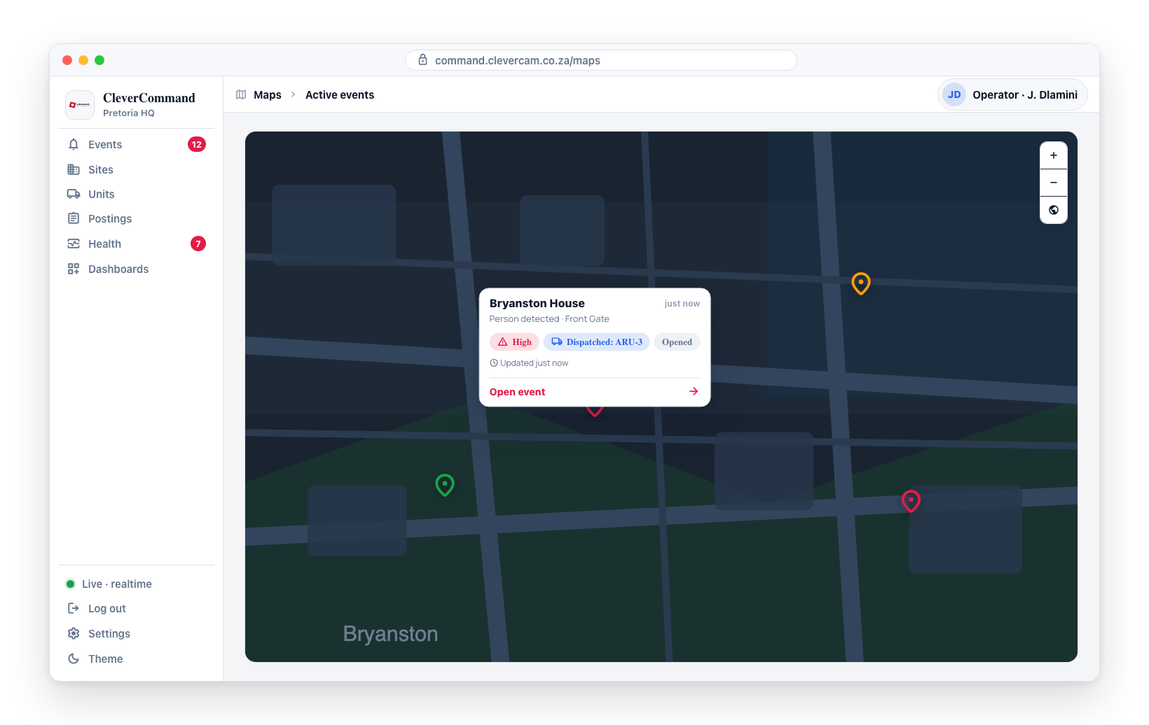
- The event label or type
- The site name
- The current state (colour-coded)
- A DURESS flag if the event is a duress event
- An Open event → button that jumps straight to the event's details page
Realtime updates
The layer subscribes to changes on vcr_events filtered by your responder_id — new events appear, state changes recolour the existing dot, and closed events disappear without a page refresh.
Community cameras layer
The Community cameras layer plots a small light-blue dot per site that has community-chime cameras linked into one of your VCR's communities. Sites typically have multiple cameras, so each dot opens a multi-camera popup rather than a single image.
- Cameras come from
community_stream_linksrows withstatus = 'approved', joined tocommunitieswherevcr_idmatches the current VCR andis_enabled = true, then grouped bysite_id - Dot position is the site's
address_latitude/address_longitude - The Layers panel count shows the total number of cameras (not sites) so you can gauge coverage at a glance
- Sites without coordinates are silently skipped
Click for site snapshots
Click a site dot to open a popup showing:
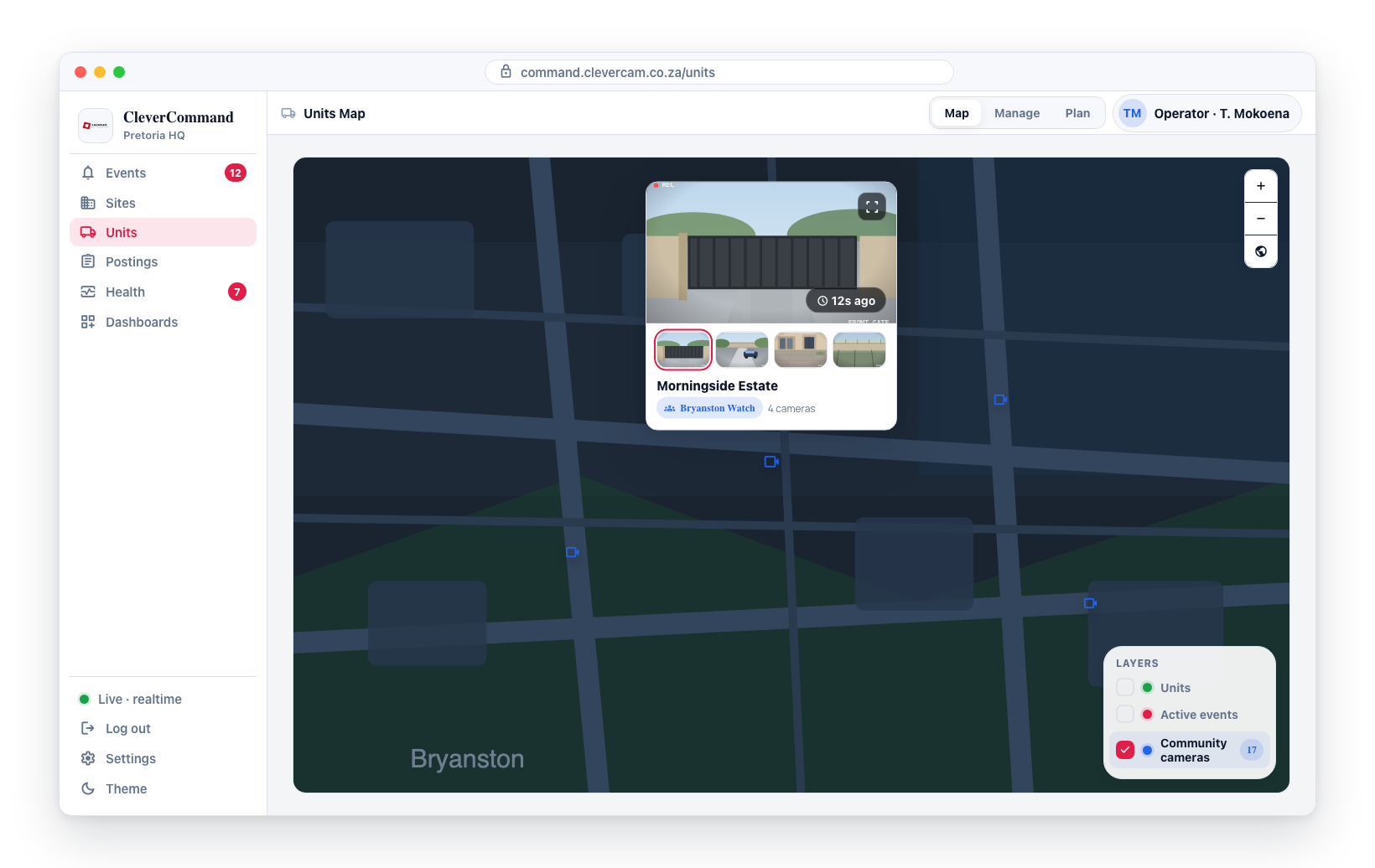
- The current snapshot of one camera at the top (
video_streams.snapshot_url), with a relative timestamp fromsnapshot_update_timeoverlaid bottom-right — same field CleverAlert's community section uses, so what you see here matches what residents see in their app - A fullscreen button (top-right of the image) that opens the snapshot at viewport size; click anywhere outside or press Esc to close
- A thumbnail strip below the main image when the site has more than one camera — click any thumbnail to swap it into the main view
- The site name, community name, and camera count
This is useful for visually triaging a neighbourhood: glance at the overview, click a dot to flip through that site's cameras, and pop one to fullscreen if you need a clear view.
Floating panel: Units vs Events
The Units Map gives the map the full canvas width. A translucent panel floats over the top-left corner with everything you need at a glance:
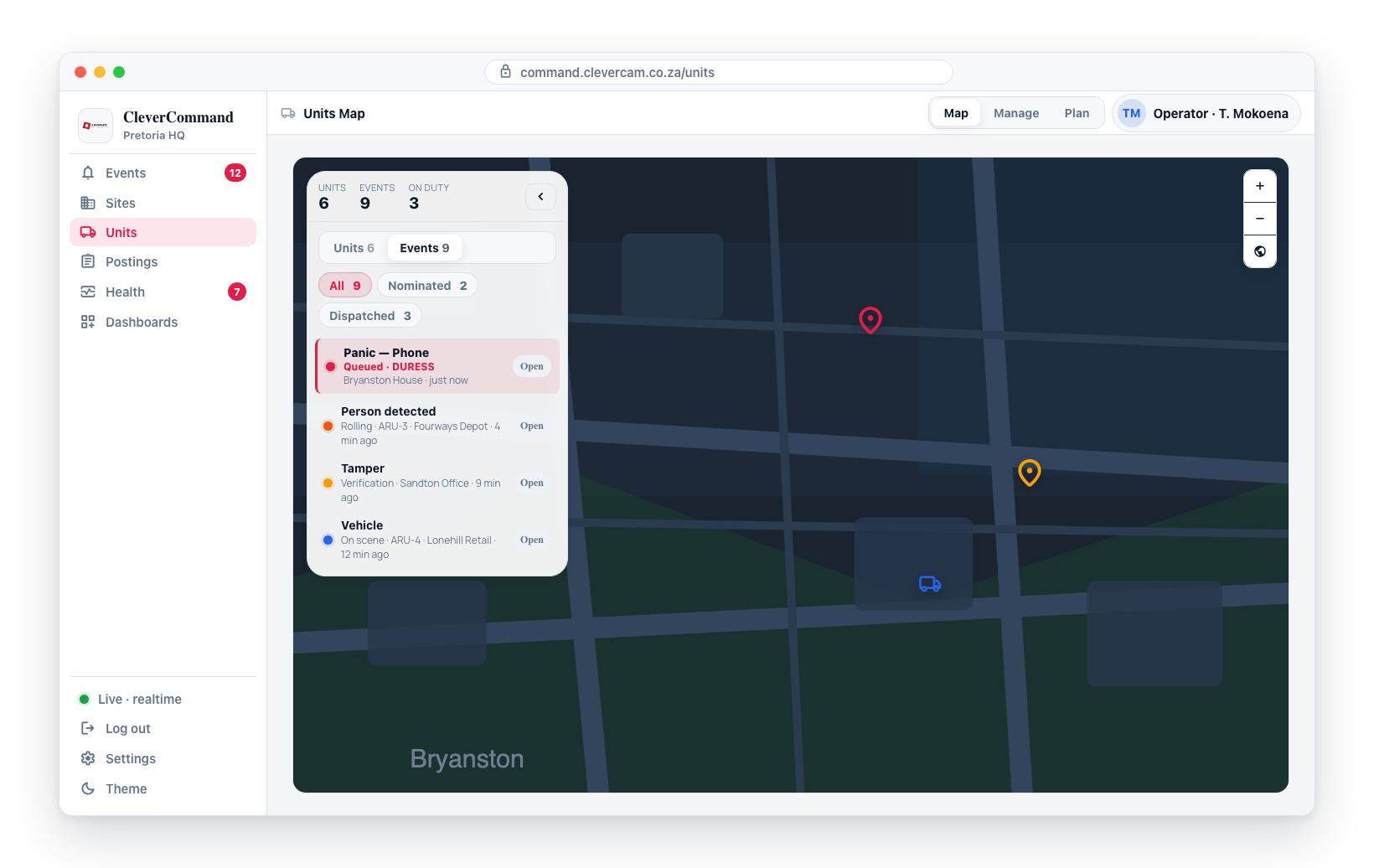
- Stat strip — counts for Units, Events, and On duty sit at the top of the panel and stay visible even when the panel is collapsed.
- Collapse toggle — the chevron in the panel header shrinks the panel down to just the stat strip, freeing the entire map. Click again to expand.
- Tab switch — under the stat strip is a two-tab pill:
- Units — list of response units with status, vehicle, and crew. Click an item to fly the map to that unit. A unit with work shows its dispatch queue underneath — one row per stop, in driving order, with a leg time and an arrival clock (see Queue ETAs below).
- Events — every active event in your operator queue, with three sub-filter pills:
- All — every open event (matches the dot count on the map's Active events layer)
- Nominated — events that have an active
vcr_dispatchesrow innominatedphase (a unit has been nominated but not yet rolling) - Dispatched — events with a dispatch row in
rollingphase, or the legacyis_dispatched/is_arrivedflag set
Each event card shows the same colour dot as the map (state palette), the title, the dispatch phase or state, the site name, and a relative timestamp. Click an event card to fly the map to its location; the Open chip on the right of the row navigates to the event's details page instead. Duress events sort to the top of the list with a red-tinted row.
The sub-filter pills affect only the floating panel list — the map's Active events layer still shows everything regardless. Use the layer toggles in the bottom-right of the map to hide events from the map itself.
Queue ETAs are never live
The leg time on a rolling stop reads elapsed / original — for example 5m / 12m, or 15m / 12m once the unit is over. The original is the road ETA captured once, at the moment the operator picked the unit in the nomination picker; the map never re-routes it afterwards. The figure is coloured by progress, judged on straight-line ground covered from where the unit rolled against the share of the ETA already used:
- Green — on track
- Amber — behind (noticeably less ground covered than time used)
- Red — overdue (past the original ETA)
A stop that has not rolled yet reads ETA ~12m; later stops in the same queue read +8m and add a seven-minute service allowance per stop. Dispatches made without a picker ETA (for example a drag-nominate on the Plan board) show a straight-line estimate at 60 km/h, marked with the same ~. The Lines connection style draws the road geometry captured at that same click; a dispatch without one draws a straight line. No part of this page calls a routing service on its own — routing is only ever bought on an operator's click.
Persistence
Layer toggle states are saved to the browser's local storage under the key unitmap.layers. Clearing site data or signing in from a different browser will reset every layer back to on.